A sphere cannot be flattened onto a plane without distortion. This is not a technical limitation of cartography; it is a theorem of differential geometry, proved formally by Carl Friedrich Gauss in 1827, but understood operationally by every mapmaker since the Greeks. Any flat map of the Earth has lied about something — area, shape, distance, direction, or some combination — and the choice of which lie to tell is the founding decision of any projection.
What Mercator did
Gerardus Mercator was a sixteenth-century Flemish cartographer working in Antwerp and later in Duisburg. In 1569 he published a world map titled Nova et Aucta Orbis Terrae Descriptio ad Usum Navigantium Emendate Accommodata — a new and augmented description of the Earth corrected for the use of navigators. The phrase "for the use of navigators" is the key.
Mercator's projection has one specific virtue: any straight line drawn on it corresponds to a constant compass bearing. If you draw a line from your departure port to your destination port and read the compass bearing of that line, you can sail that bearing the entire way and you will arrive — provided you do not run into anything in between. This is enormously useful for navigation. No other projection in 1569 had this property, and no projection since has surpassed Mercator at it.
To achieve this property, Mercator had to make a sacrifice. The projection achieves conformality (preserving local angles, which is what makes the constant-bearing property possible) by stretching the map progressively as one moves toward the poles. At the equator, the projection is essentially undistorted. At sixty degrees of latitude, areas are doubled. At eighty degrees, areas are inflated by roughly a factor of six. The poles themselves are infinitely far away.
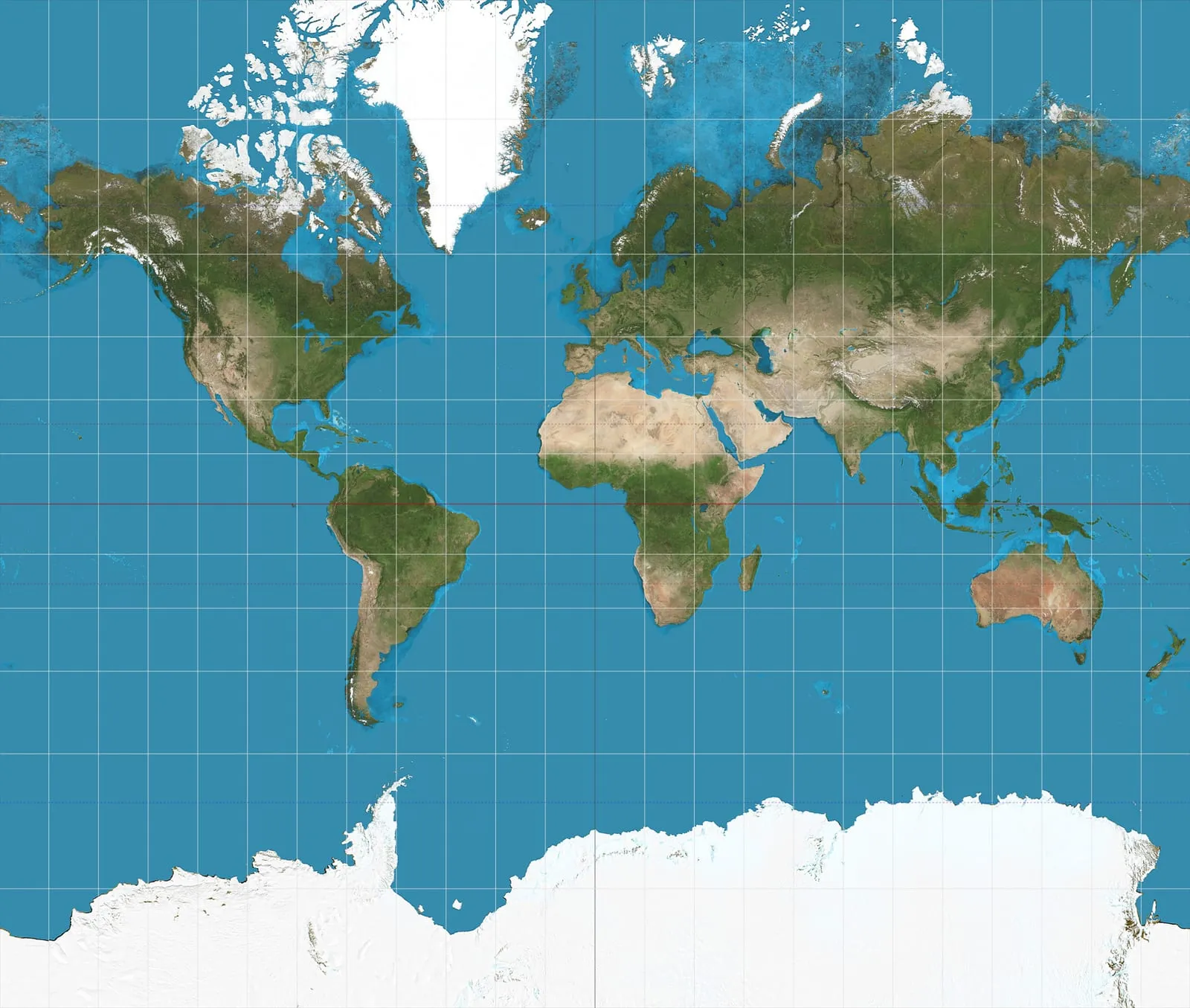
The resulting visual is the one almost any Westerner over thirty grew up with: Greenland enormous, Africa dwarfed, Antarctica an unmanageable white smear at the bottom.
What that does politically
For four centuries, the Mercator projection was the default world map in European and American classrooms, atlases, and (later) wall posters. The tropical regions — most of Africa, the Indian subcontinent, Southeast Asia, South America — appeared smaller relative to the temperate regions of Europe and North America than they actually are. The visual hierarchy of size on the page did not correspond to any physical fact about the size of the territory. It corresponded to a side-effect of a sixteenth-century navigation aid.
The political critique of this is most associated with the German historian Arno Peters, who in 1973 introduced what is now called the Gall-Peters projection — an equal-area projection on which every country occupies its true relative area. Africa, on Peters' projection, is roughly fourteen times the size of Greenland (which is geographically correct). On the Mercator, the two appear comparable. Peters' projection looks strange to anyone schooled on Mercator: countries near the equator are stretched vertically, countries near the poles are squashed horizontally, the whole thing seems vaguely wrong. That sense of wrongness is itself a measurement of how thoroughly Mercator's distortions have been internalized as the visual default.
Peters' broader argument was that the choice of projection is a political choice with educational consequences. He overstated the case in some respects — Mercator was not designed to make Europe look bigger than Africa; it was designed to help Dutch and Portuguese ships not run aground — but the basic point is sound. Defaults are not neutral. The choice of which projection a child learns first, and lives with for life, is a choice about which kind of geographical intuition that child develops.
What contemporary cartography uses
Mercator did not stay the default forever. By the late twentieth century, several alternatives had become widely available.
- Robinson (Arthur Robinson, 1963) — a compromise projection that distorts area, shape, and angle slightly everywhere rather than catastrophically anywhere. National Geographic adopted it in 1988 and used it as their standard world map for a quarter-century. It is not equal-area; it is not conformal; it just looks less wrong than the alternatives, which is exactly the design goal.
- Winkel Tripel (Oswald Winkel, 1921) — replaced Robinson at National Geographic in 1998 and remains widely used. Slightly more mathematically principled than Robinson; achieves a comparable visual outcome.
- Equal Earth (Šavrič, Patterson, and Jenny, 2018) — an equal-area projection developed specifically as an aesthetically acceptable alternative to Gall-Peters. Equal area, modestly distorted at the poles, visually pleasant.
- AuthaGraph (Hajime Narukawa, 1999, refined in 2016) — a modern equal-area projection based on tetrahedral subdivision. Used primarily in Japan; visually unfamiliar but technically excellent.
- Mercator itself — still ubiquitous, but now confined to its appropriate use case: web mapping (Google Maps, OpenStreetMap, etc.) where the local-conformality property keeps streets perpendicular at any zoom level. At any reasonable city-scale zoom, the area distortion is negligible.
The major cartographic professional bodies — including the American Cartographic Association — issued statements in 1989 and 1990 against the use of Mercator for general-purpose world maps, recommending compromise projections instead. Most major publishers complied. Most school districts did not, primarily because changing wall maps costs money and because nobody complained loudly enough.
Why every projection is a choice
There is no neutral projection. There are only projections optimized for different purposes:
- Navigation along a constant compass bearing — Mercator is best, and was designed to be.
- Comparing the sizes of countries — any equal-area projection (Mollweide, Gall-Peters, Equal Earth) is correct; Mercator is catastrophically wrong.
- Showing the shortest route between two points — a great-circle gnomonic projection, on which all great circles appear as straight lines. Useless for general-purpose maps; perfect for plotting flight routes.
- Looking pretty in a textbook — compromise projections (Robinson, Winkel Tripel) are designed for this.
Choosing one is choosing what kind of question you are asking the map to help answer. The answer is in the projection.
What stayed with me
That for the entirety of the twentieth century, hundreds of millions of children learned what the world looks like from a map designed to help sixteenth-century Dutch ships not crash, and that the strangeness this produced — a popular intuition that Greenland is the size of South America, that Russia is enormous, that Africa is a sort of medium-sized continent — was not a quirk but a training effect. We taught the eye one shape of the world. The eye learned it. The world is not that shape.